Are you looking to visualize data effectively using Excel charts and graphs? This comprehensive guide from HOW.EDU.VN provides a detailed, step-by-step approach to create impactful visuals from raw numbers. Mastering the creation of Excel graphs not only enhances data understanding but also improves communication and decision-making, utilizing various chart types like bar graphs, line graphs, and pie charts to present data efficiently.
Table of Contents
1. What is an Excel Chart or Graph?
Excel charts or graphs are visual representations of data from a Microsoft Excel worksheet. These tools allow you to identify trends, make comparisons, recognize patterns, and derive insights from numerical data. Excel offers numerous chart and graph options, including bar, line, and pie charts, each serving different purposes in data visualization.
Why Visualize Data in Excel?
Visualizing data in Excel helps audiences better understand and retain information. Graphs make data visually digestible and communicate findings clearly, especially with large datasets. Excel charts and graphs offer various options for creating impactful visuals when data presents multiple findings, such as comparisons or changes over time.
2. How to Create a Graph in Excel
Creating a graph in Excel is straightforward. Here’s a step-by-step process to follow:
- Enter your data into Excel.
- Choose your graph or chart type.
- Highlight data and insert your graph.
- Switch your axes if needed.
- Customize colors and layout.
- Adjust label sizes.
- Refine Y-axis measurements.
- Reorder your data.
- Add a compelling title.
- Export your graph like a pro.
Let’s dive into each step in more detail:
2.1. Enter Your Data Into Excel
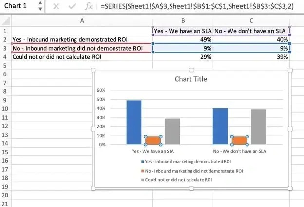
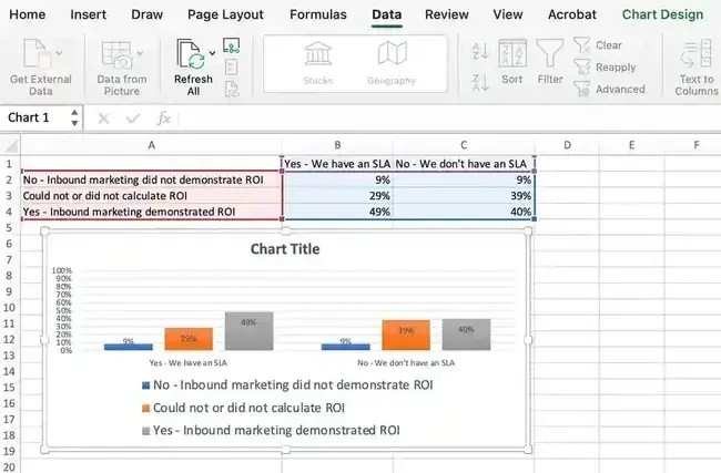
Begin by entering your data into Excel, organized into columns and rows. Whether you’re importing data from a survey tool, downloading it from your marketing platform, or typing it in manually, organization is key.
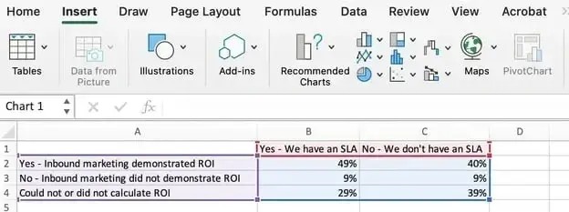
Example: To visualize marketing ROI, organize data as follows:
- Column A: Responses to the question, “Did inbound marketing demonstrate ROI?” or “Could not or did not calculate ROI?”
- Columns B and C: Responses detailing whether or not the company had a formal sales-marketing agreement.
As per this data arrangement, Column B, Row 2 illustrates that 49% of people with a service level agreement (SLA) also say that inbound marketing demonstrated ROI.
2.2. Choose Your Graph or Chart Type
Once your data is organized, choose the appropriate graph style. Excel offers many options, including bar charts, line graphs, pie charts, and scatter plots.
Select the type that best tells your story. For example, use bar graphs for comparing things and pie charts for emphasizing percentages.
Consider your audience and whether you want a simple or creative flair.
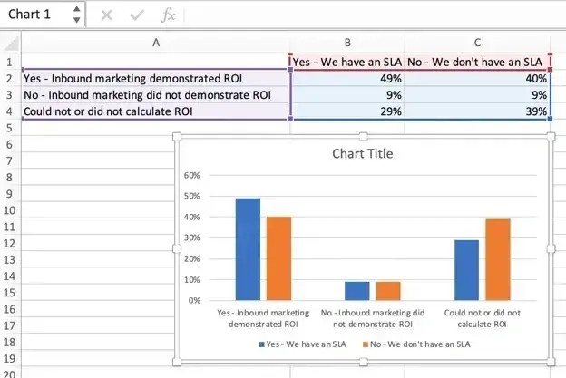
2.3. Highlight Data and Insert Your Graph
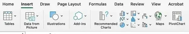
Highlight the cells you want to visualize (including the headers). Click on the Insert tab and select the chart type you’ve decided on.
Choose a clean, two-dimensional column chart for a sharp and professional look.
Customize based on the audience. For a construction client, use a three-dimensional chart to mimic skyscrapers.
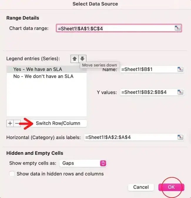
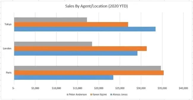
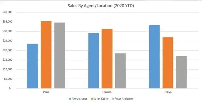
2.4. Switch Your Axes If Needed
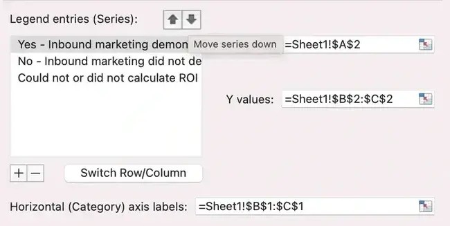
If the X and Y axes need swapping for clarity, right-click on the graph, select Select Data, and hit the Switch Row/Column button.
For example, if your presentation focuses on SLAs, flip the axes to emphasize this data.
This simple change can significantly improve clarity.
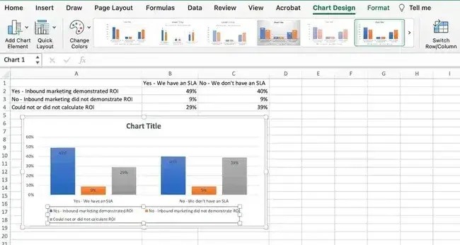
2.5. Customize Colors and Layout
Customize colors and layout by clicking on the chart and exploring the Chart Design tab. Adjust layouts, colors, and legend placement.
Use softer tones for internal presentations and bold, branded colors for external audiences. Customize bar colors to match the brand palette for key clients, making the chart more professional.
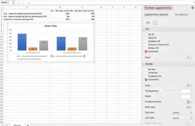
Format the legend further by clicking on it and hovering over the Format Legend Entry sidebar.
Change the fill color of the legend to change the color of the columns. Format other parts of the chart by clicking on them individually to reveal a corresponding Format window.
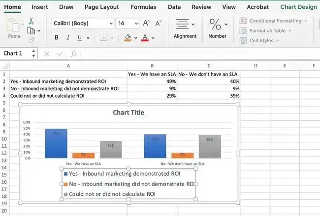
2.6. Adjust Label Sizes
Adjust label sizes to ensure they’re legible, especially during presentations. Click on the label, go to the Home tab, and adjust the font size.
This simple step can make a big difference.
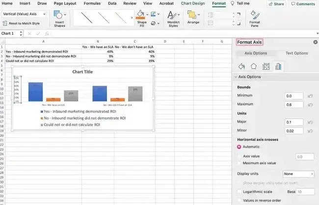
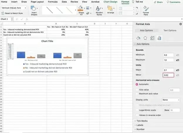
2.7. Refine Y-Axis Measurements
Customize your Y-axis measurements if Excel’s default settings don’t suffice. Click on the Y-axis percentages in your chart, which reveals the Format Axis window.
Decide whether to display units on the Axis Options tab and whether to show percentages to two or no decimal places.
Change the maximum percentage to 100% to represent data on a universal scale.
Increase the font size of the Y-axis via the Home tab to enhance visibility.
2.8. Reorder Your Data
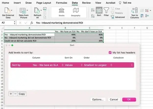
Reorder your data if it appears better in reverse order. Right-click on the graph and click Select Data to reveal the same options window as in Step 3. To reorder, choose the arrow up or down to reverse the order of your data on the chart.
Re-arranging in ascending or descending order is possible even when there are more than two lines of data to adjust. Highlight all of your data in the cells above your chart, click Data, and select Sort.
Choose to sort based on the smallest to largest or vice versa.
This version reflects the progression of results and is more visually persuasive.
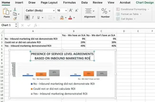
2.9. Add a Compelling Title
Add a title by clicking on the default Chart Title to reveal a typing cursor. Replace it with something specific and engaging.
Use font formatting options to give your title the emphasis it deserves.
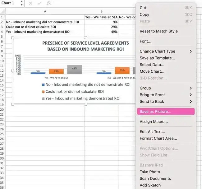
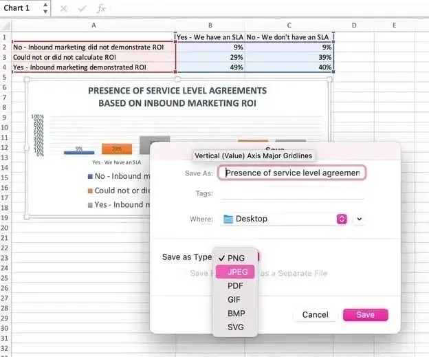
2.10. Export Your Graph Like a Pro
Export your graph by right-clicking on the chart and selecting Save as Picture. This gives you a clean, high-quality image for presentations, Canva graphics, and social media posts.
Add the file name, location, and type while saving.
3. Visualize Data Like a Pro: How to Experiment With Chart Types
Experiment with different chart types to present your story in the best-suited manner. Here’s how to swap chart types in Excel:
- Step 1: Select the chart. Click on a blank area of your chart to select it.
- Step 2: Open the chart design tab. Head to the ribbon and click the Chart Design tab.
- Step 3: Change the chart type. Click Change Chart Type, and Excel shows you all your options.
- Step 4: Shop for the best fit. Scroll through the Recommended Charts and All Charts tabs, clicking through options and seeing how your data transforms.
4. The 18 Types of Charts in Excel
Understanding different chart types in Excel helps optimize how you present information. Here are some useful options for marketers:
4.1. Excel Charts Most Useful to Marketers
- Area Chart: See trends over time or other relevant variables. Essentially a line graph with colored-in sections emphasizing progression.
*Best for:* Demonstrating the magnitude of a trend between two or more values over a given period.- Clustered Bar Graph: Represents information horizontally and compares different data series.
*Best for:* Comparing the frequency of similar values between different variables.- Clustered Column Charts: Similar to bar graphs but vertical, helping viewers rank different data elements.
*Best for:* Displaying various data elements to rank them visually over time.- Line Graph: A simple but highly effective way to visually see trends over time and compare multiple data series.
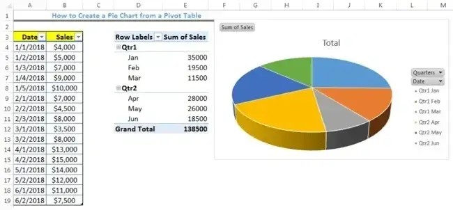
*Best for:* Illustrating trends over time, such as spikes or drops in sales due to holidays, weather, or other variables.- Pie Chart: Helps see how different data elements proportionally compare.
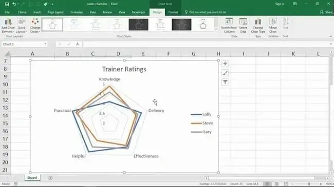
*Best for:* Showing values as percentages of a whole and viewing data elements proportionately.- Radar Chart: Displays data in a closed, multi-pointed shape, comparing different data elements.
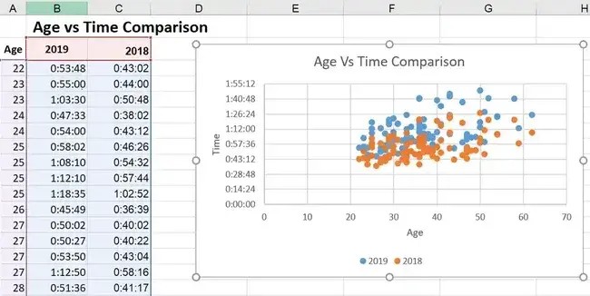
*Best for:* Comparing the aggregate values of multiple data series at once.- Scatter Plot: Evaluates the relationship between two variables on the X- and Y-axes, identifying correlations and patterns.
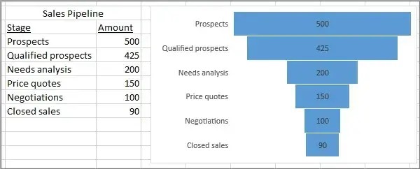
*Best for:* Visualizing positive or negative relationships between two variables.- Funnel Chart: Well-suited for marketers optimizing processes and pipelines.
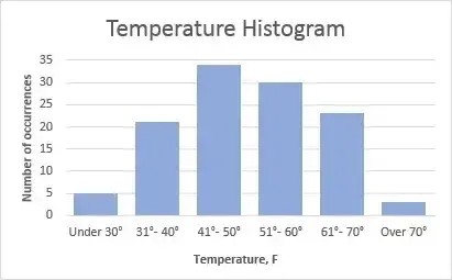
*Best for:* Visually representing changes through processes to clarify where the biggest changes occur along the way.- Histogram Chart: Solid option when explaining data that occurs most usefully in ranges.
*Best for:* Demonstrating data findings that are most noticeable and useful when the data is grouped in ranges.4.2. Advanced Excel Charts
Advanced charts are more complicated and better suited to audiences who can already read advanced-level charts. Some of these include:
- Box and whisker chart.
- Pareto chart.
- Surface chart.
- Sunburst chart.
- Treemap chart.
4.3. Industry-Specific Excel Charts
The remaining Excel chart types don’t typically lend themselves to marketing. However, if your niche calls for it, these charts are there to support you:
- Stock chart.
- Waterfall chart.
- Filled map chart.
- Combo chart.
5. Summarizing the Charts
Here’s a concise comparison of the Excel charts most helpful to marketers:
| Type of Chart | Use |
|---|---|
| Area | Demonstrates the magnitude of a trend between two or more values over a given period. |
| Clustered Bar | Compares the frequency of values across different levels or variables. |
| Clustered Column | Displays data changes over a period of time to visualize rank among data sets. |
| Line | Illustrates trends over time. |
| Pie | Shows values as percentages of a whole. |
| Radar | Compares the aggregate value of multiple data series. |
| Scatter | Shows the positive or negative relationship between two variables. |
| Funnel | Excels at visualizing changes to one data point over various processes. |
| Histogram | Shows variations in data that are best represented as a range of values. |

6. Excel Charting Adventure: Confidence and Mastery Await
Creating graphs and charts in Excel is about the process. With a clear, step-by-step approach, building charts becomes second nature. Experiment, adjust, and learn from mistakes to grow your skills.
Why Choose HOW.EDU.VN for Expert Data Visualization Guidance?
Navigating the complexities of data visualization can be challenging. At HOW.EDU.VN, we understand the difficulties in creating meaningful and impactful graphs and charts in Excel. Our team of experienced professionals, including PhD-level experts, is dedicated to providing you with the knowledge and skills necessary to excel in data presentation.
Challenges in Data Visualization
Many individuals and organizations face common hurdles when working with data:
- Difficulty Selecting the Right Chart Type: Choosing the appropriate chart or graph to represent your data can be overwhelming with numerous options available.
- Time-Consuming Customization: Tailoring charts to meet specific requirements and branding guidelines can be a tedious and time-intensive process.
- Ensuring Data Accuracy: Presenting data accurately and avoiding misinterpretations is crucial for making informed decisions.
- Lack of Design Expertise: Creating visually appealing and professional-looking charts often requires design skills that many users may not possess.
How HOW.EDU.VN Can Help
HOW.EDU.VN offers a range of services designed to address these challenges and empower you to create compelling data visualizations:
- Expert Guidance: Our team of PhD-level experts provides personalized guidance on selecting the most effective chart types for your data and objectives.
- Customized Solutions: We offer tailored solutions to help you customize your charts to align with your branding and specific requirements.
- Data Validation: Our experts ensure your data is accurately represented, minimizing the risk of misinterpretation and flawed decision-making.
- Design Support: We provide design support to help you create visually appealing and professional-looking charts that effectively communicate your message.
Benefits of Consulting with Our Experts
Partnering with HOW.EDU.VN for your data visualization needs offers numerous benefits:
- Improved Data Communication: Effectively communicate complex data insights to your audience, enhancing understanding and engagement.
- Enhanced Decision-Making: Make informed decisions based on accurate and visually compelling data representations.
- Time Savings: Save valuable time and resources by leveraging our expertise to create charts efficiently and effectively.
- Professional Results: Present data with confidence, knowing your charts are visually appealing, accurate, and professionally designed.
Don’t let data visualization challenges hold you back. Contact HOW.EDU.VN today to connect with our team of PhD-level experts and unlock the full potential of your data.
7. Excel Graph and Chart FAQs
What is the best chart to use in Excel?
The best chart depends on your data and what you want to show. Bar charts are good for comparing categories, line charts for trends, and pie charts for proportions.
How do I make a simple graph in Excel?
Enter your data, highlight it, go to the Insert tab, and pick a chart type. Excel will create a basic graph for you.
Can I change the chart type after creating it?
Yes, select the chart, go to Chart Design, and click Change Chart Type to choose a new one.
How do I add labels to my Excel graph?
Click on the chart elements, then add data labels to show values directly on the graph.
How do I customize the colors of my chart?
Click on the chart, go to Format, and change the fill and outline colors for different elements.
What’s the difference between a chart and a graph in Excel?
The terms are often used interchangeably. Both visualize data, but “chart” is a broader term including various types like bar, line, and pie charts.
How can I add a title to my graph?
Click on the chart, then add or edit the Chart Title to describe what the graph shows.
How do I save my Excel graph as an image?
Right-click on the chart and select Save as Picture to save it as a JPEG or PNG file.
Can I create a graph from data in multiple sheets?
Yes, use the Select Data option to choose data from different sheets for your graph.
Where can I find more help with Excel charts?
Check the Excel help menu or visit the Microsoft Office support website for tutorials and tips.
Ready to transform your data into compelling visuals?
Don’t let the complexities of data visualization hold you back. At HOW.EDU.VN, our team of over 100 world-renowned PhDs is ready to provide expert guidance and customized solutions to meet your unique needs.
- Connect directly with leading experts: Gain access to unparalleled expertise and personalized advice.
- Save time and resources: Let our professionals handle the intricacies of chart creation, so you can focus on your core objectives.
- Ensure accuracy and impact: Present data with confidence, knowing your visualizations are accurate, visually appealing, and professionally designed.
Contact us today for a consultation:
Address: 456 Expertise Plaza, Consult City, CA 90210, United States
WhatsApp: +1 (310) 555-1212
Website: HOW.EDU.VN
Let how.edu.vn empower you to unlock the full potential of your data and make informed decisions with confidence.